Invest with Certainty: Unlock Your Competitive Advantage in Australian Real Estate with Quartile Pricing Analysis

Real estate investment often presents a labyrinth of data and trends. Your ability to interpret these insights can significantly influence your decision-making success. This article unravels the power of quartile pricing analysis, a tactic that can instil confidence, enhance control, and guide your strategic decisions in the Australian property market.

Photo by Nicolas Gonzalez on Unsplash

Market Segmentation in Real Estate: Beyond Overall Median Sale Price

In real estate analysis, the overall median sale price of a suburb often dominates discussions. While it offers a snapshot, it doesn’t fully capture the diverse price dynamics within a suburb. This is where quartile analysis comes in. Quartiles break down the property market into distinct segments based on the Smart Median Sale Price, giving you a nuanced view of market dynamics. Recognising how each of these segments behave provides a comprehensive understanding of the market to shape your investment strategy.

Understanding the Top Quartile: Glimpses into the Premium Market

The top quartile encapsulates Australia’s premium housing market, a niche with unique behavioural patterns. An upswing in median sale prices within this segment could signal a growing demand for luxury properties, particularly evident during periods of positive overall economic conditions.

Understanding the Bottom Quartile: Unmasking Housing Affordability

Conversely, the bottom quartile represents the affordable housing sector. A quick surge in the median sale prices in this segment could signify intensified demand from first-time homebuyers or investors eyeing strong rental yields. Generally, the bottom segment of housing stock will continue to sell at the same pace irrespective of broader economic conditions. Monitoring these shifts helps you tap into investment opportunities that others might miss.

Unveiling Market Dynamics Through Quartile Analysis

Changes in quartiles over time expose crucial market dynamics that the overall median sale price fails to capture. For example, if the top quartile’s median sale prices are growing faster than the bottom quartile, it suggests that wealthier buyers are influencing property values. On the other hand, faster growth in the bottom quartile could signal a market shift towards more affordable housing. With this understanding, you can inform your investment strategy and foresee future market trends.

Quartile Analysis in Action: A Case Study from Sydney’s Housing Market

To illustrate the power of quartile analysis, let’s consider the property market of Paddington in Sydney. During the period from November 2020 to February 2021, the median house sale price grew by 22.4% from $2,500,000 to $3,060,000. If we look closer at the pricing quartiles, we can see the bottom quartile prices grew faster than the top quartile, signalling a shift in market dynamics towards more affordable properties. The bottom quartile grew by 35.86% from $1,840,000 to $2,500,000 while the top quartile only grew by 17.26% from $3,360,000 to $3,940,000. Savvy investors who noted this trend early would have capitalised on the changing market.

Median House Sale Price in Paddington, NSW

Beyond Quartiles: Other Key Metrics in Real Estate Analysis

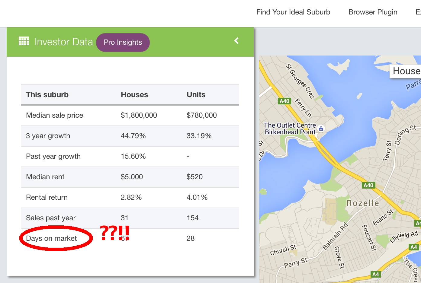
While quartiles offer vital insights into price dispersion, they are part of a broader data landscape. Other factors, such as volume of houses sold and days on market, are also integral to the property buying process. Integrating these metrics with quartile analysis paints a comprehensive picture of the Australian housing market.

In the ever-changing Australian real estate market, analysing top and bottom quartiles of median sale prices is more than a statistical exercise. This tool not only helps you dissect market segmentation and track dynamics but also instils confidence and control in your investment decisions.

Mortgage Stress in Australian Real Estate: What You Need To Know

Are you prepared for the effect that mortgage stress can cause in the Australian real estate market? Whether you’re an experienced investor or an agent, it’s crucial to understand the intricate dance of factors at play within the property market, and mortgage stress is a significant part of that mix. This article pulls back the curtain on mortgage stress, revealing its hidden impacts on property values, shining a spotlight on the most affected suburbs, and underlining the vital importance of examining mortgage stress at the local-level.

Aerial view of outer suburb in Melbourne, Australia.
Photo by Tom Rumble on Unsplash

What is Mortgage Stress?

Mortgage stress is a financial situation where homeowners spend 30% or more of their pre-tax income on mortgage repayments. According to the Australian Bureau of Statistics, when housing costs exceed this threshold, households may struggle to afford other essential living costs. While the specific percentage can vary, this 30% figure is a commonly accepted benchmark. This stress can lead to financial hardship, and in severe cases, may result in the inability to meet mortgage payments, leading to foreclosure.

What Impact Does Mortgage Stress Have on Property Values?

Mortgage stress can have significant repercussions on property values and the broader real estate market. When a large number of homeowners experience mortgage stress, it increases the supply of properties on the market, as distressed homeowners may be forced to sell. This oversupply can lead to a decrease in property values.

For instance, the Global Financial Crisis in 2008 witnessed a surge in mortgage stress levels, causing a temporary dip in Australian property prices. The negative effect of mortgage stress on property values can create opportunities for savvy investors to snap up undervalued properties. However, it also introduces more uncertainty into the market, making careful risk assessment crucial.

Why is it Important to Look at Mortgage Stress on a LGA-Level?

Examining mortgage stress on an LGA-level provides granular insight into the local housing market conditions. Each LGA has unique economic factors, housing supply and demand, employment rates, and demographics influencing its mortgage stress levels.

For instance, an LGA with a high unemployment rate might experience increased mortgage stress levels in the future. This level of detail can enable property investors to make informed decisions. It helps in identifying potential risks and opportunities, understanding local market conditions, and devising effective investment strategies. Tools like Microburbs can help explore these specifics.

To deepen our understanding of mortgage stress and its implications on property investments, let’s take a look at three critical indicators provided by Microburbs. These metrics can empower investors and buyers agents with nuanced perspectives on mortgage stress at a granular level.

  • Mortgage as a Percent of Income: This metric represents the portion of a household’s pre-tax income used for mortgage repayments. It provides a snapshot of the potential affordability issues within a specific suburb.
  • Mortgage Non-Stress (LGA): This metric indicates the percentage of households within a Local Government Area (LGA) spending less than 30% of their pre-tax income on mortgage repayments. A higher percentage of non-stressed households can suggest a more stable real estate market, potentially making it a safer investment area.
  • Mortgage Stress (LGA): Conversely, this metric shows the percentage of households in an LGA spending more than 30% of their pre-tax income on mortgage repayments. Areas with high mortgage stress could be facing economic challenges or over-inflated property values. This could potentially create investment opportunities for savvy buyers or pose additional risks.

Annual Income Needed to Avoid Mortgage Stress in Capital Cities

Average income earners in Australia are unable to afford a house in a capital city without plunging into immediate mortgage stress. This table illustrates the annual household income needed to comfortably afford a house in various Australian capital cities. It’s calculated based on the most recent Smart Median Sale Prices and the standard variable interest rate.

Smart Median Sale PriceDeposit (20%)Monthly Repayments (6.44% Var. Rate)Annual Household Income needed to avoid Mortgage Stress (Pre-tax)
Sydney$1,940,000$388,000$9,749$680,133
Melbourne$1,460,000$292,000$7,337$498,667
Brisbane$1,040,000$208,000$5,227$339,920
Perth$782,000$156,400$3,930$242,340
Annual Income Needed to Avoid Mortgage Stress in Capital Cities, Microburbs

What Suburbs in Each State Experience the Greatest Mortgage Stress?

Mortgage stress varies across states and suburbs in Australia. Here are a few examples:

  • In New South Wales, Western Sydney suburbs like Villawood, Yennora and Granville have high levels of mortgage stress.
  • In Victoria, the outer suburbs of Melbourne, including Ravenhall and Woodstock, are significantly impacted.
  • In Queensland, Caboolture and its surrounding suburbs have reported higher mortgage stress levels.

Mortgage stress is a critical factor affecting the Australian real estate market. Understanding its impacts and how to mitigate its risks can provide investors and agents with a competitive edge. Always remember, thorough research and careful planning are keys to successful property investment in these complex market conditions.

Understanding Land-to-Asset Ratio: A Key to Australian Property Investment

Navigating the Australian real estate market can be a daunting task, but understanding key metrics like the land-to-asset ratio can guide your path to successful property investment. This post will provide insights into the importance of the land-to-asset ratio, how it’s calculated, and how it can impact your potential return on investment.

Aerial view of Melbourne, Australia during the daytime.
Photo by Pat Whelen on Unsplash

What is the land-to-asset ratio?

The land-to-asset ratio is a real estate valuation measure that compares the value of the land on which a property stands to the total value of the property – including the land, buildings, and any improvements. This ratio is particularly useful to property investors and agents as it helps determine the intrinsic value a piece of land holds in a property, thereby influencing its potential for appreciation and impact on returns.

How is the land-to-asset ratio calculated?

The formula for calculating the land-to-asset ratio is very straightforward:

Land-to-Asset Ratio = (Value of Land / Total Value of Property) x 100%

The formula for calculating land-to-asset ratio.

Consider two properties, both valued at $500,000, but with different land values:

Property AProperty B
Land Value$300,000$200,000
Purchase Price (or Estimated Value)$500,000$500,000
Land-to-Asset Ratio60%40%

Property A, with a higher land value, has a higher land-to-asset ratio. This higher ratio can potentially offer better capital growth prospects due to the inherent value of the land. However, as we will discuss further, the ideal ratio is influenced by various factors.

What is the ideal land-to-asset ratio?

While there’s no universal ‘magic number’, from an investment perspective, try to aim for an asset where the land represents at least 70% of the property’s value. In a pinch, don’t settle for anything below 50%. But remember, real estate isn’t a game of absolutes – the ‘perfect’ ratio depends on your unique financial goals, risk appetite, and market dynamics.

How does land-to-asset ratio impact the potential return on investment?

Land tends to appreciate over time, often at a faster pace than the value of the building or improvements. Therefore, a property with a higher land-to-asset ratio can potentially offer higher capital growth, leading to increased returns on investment. Furthermore, the potential for redevelopment or subdivision can also add to the investment’s value.

What are the drawbacks of properties with high land-to-asset ratios?

While properties with high land-to-asset ratios can offer more significant capital growth potential, they are not without their drawbacks. Firstly, such properties may have higher upfront costs, requiring a larger initial investment.

Additionally, because the value is tied more to the land, improvements or renovations to the property may not contribute significantly to its overall value. This might limit the profitability of value-adding strategies.

Compared to properties teeming with improvements, a high land-to-asset ratio property might also fetch you less rental income, potentially dampening your cash flow.

Modern two-storey home viewed from street level.
Photo by Brian Babb on Unsplash

How does the land-to-asset ratio impact the maintenance costs and depreciation of a property?

Properties with lower land-to-asset ratios often mean that a larger portion of the property’s value is tied to the building or improvements, which depreciate over time. These properties also come with higher maintenance costs. 

On the other hand, land, which contributes to a higher land-to-asset ratio, requires little to no maintenance, reducing the overall running costs.

How does the land-to-asset ratio vary across different property types and suburbs?

The land-to-asset ratio can significantly vary across different property types and suburbs. Detached houses often sport higher ratios than apartments or units, where you’re paying more for the building than the land. Similarly, the land-to-asset ratio can swing wildly from one suburb to another, juggling factors like proximity to the city centre, local amenities, and demand-supply dynamics. Luckily, tools like Microburbs can help you decode these local market dynamics.

Why Are Median and Quartile Land-to-Asset Ratios for a Suburb Relevant?

The median land-to-asset ratio for a suburb gives you a snapshot of the ‘average’ property landscape, acting as a key guide to inform your investment strategy. 

The 25% and 75% land-to-asset ratio quartiles add another layer to the story. They provide a more nuanced view of the property distribution, providing a framework for potential bargains and premium properties. A wide spread between these quartiles indicates greater variability in property types and potential investment strategies. A lower 25% quartile might indicate more affordable investment opportunities, while the 75% quartile can reflect properties with high land value – potential goldmines for capital growth.

In the end, understanding the land-to-asset ratio is like unlocking a secret level in the game of Australian real estate. Sure, it’s not the be-all and end-all, but combined with other factors such as location, market conditions, and your personal financial goals, it can be a game-changer.

Are Tired Misconceptions Blinding You from Sydney’s Next Boom Suburbs?

For most who live within 10 or 20km of the centre of Sydney, the West seems to be considered a sprawling void of fibro shacks and bogans. This ignorance might be funny to those of us enjoying the west (life is peaceful here!), but if you’re a property investor who’s written off the western suburbs without checking your facts, you could be passing up big opportunities.

I live in Kings Langley, located 45km from the Sydney CBD, and whenever I mention that I live ‘near Blacktown’, more often than not I get asked ‘Is it safe?’ Well, it is certainly is safe. The Microburbs Safety Score, based in NSW on Bureau of Crime Statistics and Research data, rates Kings Langley at 9/10, which is miles ahead of the trendy inner suburbs. With the North West Metro coming in less than 3 years, the area is set to be cracked wide open, and by the time Sydney wakes up to what’s on offer, investors will have missed the boat.

Bella Vista

Bella Vista is among some of the most well known suburbs in Sydney to those who have never stepped foot in the west. A key selling point for this suburb is not just the abundance of palatial two storey homes but also the well designed landscaping and large public parks. The share of land between commercial precincts and residential areas has also been well balanced.

The Norwest business park is a 5 minute drive away and already hosts offices from big companies like Woolworths, PwC, Schneider and Resmed. Expected completion for the North West Metro will be in 2019 and will include stations for both Bella Vista and Norwest.

For working parents, there is better supply of child care services making it far more affordable than the city. Some big landmarks include the Norwest private hospital & Hillsong church.

Also located in Bella Vista is Matthew Peace primary school which is ranked among the top 10 in the state

Microburbs Report for Bella Vista

Microburbs Safety Score: 9/10

Median House Price: $1,378,000

Median Rent: $780/wk

Annual Growth: 10.1%

Kings Langley

My home burb’  is located just west of the prestigious Bella Vista and 5km north of Blacktown. The homes there were mostly built between the 60’s and 80’s so you’ll expect to see a lot of brick. The strict council covenants on development in this suburb have ensured that the streetscape has a lot of unity and appeal.

Kings Langley is also a go-to destination for cyclists who want to take advantage of the purpose built cycleway along the M7.

Lower mortgage rates and better family friendly facilities adds to the quality of life in suburbs like Kings Langley. The high numbers of owner-occupied homes is also indicative of this quality.  

Microburbs Report for Kings Langley

Microburbs Safety Score: 9/10

Median House Price: $857,000

Median Rent: $520/wk

Annual Growth: 9.7%

The Ponds

The Ponds has become one of the most sought after suburbs in the west. Compared to the same period five years ago, the median house sales price for houses increased 165.5% (realestate.com.au).

image04

The Ponds is much newer than the established suburbs of Baulkham Hills and Bella Vista but with the Rouse Hill Town Centre just 10 minutes away and the higher abundance of public parks & recreation areas makes it very liveable.

This suburb has won several town planning design awards for its innovative use of space and using the local stormwater to make an artifical pond known as ‘The Ponds Lake’. These areas make the suburb a great place of community where families often gather in evenings and host barbeques. The clever use of public space is also designed to compensate for the small backyard sizes that are increasingly common in new suburbs.

Another selling point is the proximity to the council owned leisure and aquatic centre known for its popular wave pool.

Microburbs Report for The Ponds

Microburbs Safety Score: 8/10

Median House Price: $942,000

Median Rent: $650/wk

Annual Growth: 21.6%

Baulkham Hills

(With the exception of areas directly near the shopping centre) the high affluence level, distance from train stations and large land sizes make Baulkham Hills one of the safest suburbs in Sydney.

Located just above Castle Hill, the hills shire is is known for its abundance of local parks, with a total of 329 parks in total to walk the dog or play with the kids.

Whilst there is no train station, busses to the city provide an express trip to CBD via M2 and Lane Cove Tunnel with a travel time of around 30-40 minutes. Baulkham Hills high school, an academically selective school is consistently ranked among the top 10 in the state.

Low traffic levels and easy parking is a key benefit of western suburbs like Baulkham Hills. This makes regular travel to places like supermarkets, convenient and less stressful.

Microburbs Report for Baulkham Hills

Microburbs Safety Score: 9/10

Median House Price: $1,060,000

Median Rent: $580/wk

Annual Growth: 11%

Glenmore Park

A lesser known suburb sitting on the edge of Sydney is Glenmore Park, located 8km south of Penrith and right next to the blue mountains. A key advantage of the west is that lower density living means overall lower noise levels and better peace at night. Despite being located close to Penrith, Glenmore Park is often described as a very friendly suburb with neighbours you can ‘trust a spare key to your house with’.

With a median house price of just $700,000 this makes it makes it the most affordable on this list. In terms of public transport, Penrith train station is just a 15 minute drive away. Combined with an express train to the city, the total journey is just over an hour to get to work; not too bad for suburb located 59 kilometers from the city.
Microburbs Report for Glenmore Park

Safety Score: 9/10

Median House Price: $700,000

Median Rent: $490/wk

Annual Growth: 9.7%

If you’re an informed investor, and I’m guessing you are if you’re on the Microburbs blog, I would encourage you to take a drive through these parts of outer western Sydney. You may be surprised by the communities and opportunities you find out here.

Explore beyond the stereotypes and myths and get the facts now with a Microburbs report on any address or area in Australia:

For press enquiries about this article, please call Microburbs Founder Luke Metcalfe on 0414 183 210.

8 Real Estate Investment Metrics You Need to Understand

With some analysts predicting that real estate price growth may slow down in Sydney and Melbourne, real estate investing in Australia may no longer be all hot markets and high demand. Understanding where markets are hot and cold, fast and slow, is about understanding supply and demand, yield, days on market and OSI. But what does that all even mean?

Microburbs founder, Luke Metcalfe sat down with Jeremy Sheppard from DSR Data to get plain english explanations for the most important real estate investment metrics.  In 2009, after building his career in IT and a portfolio of 16 properties, he launched DSR data to help make property investment more consistent and more effective for more people. Jeremy has been writing articles for Your Investment Property magazine since 2011, educating investors on how to use data to better their returns.

#1  “Vendor Discount”

This is the percentage difference between the original asking price and the eventual sale price. When a seller puts their property on the market, usually via real estate agent, they pick an initial asking price and it’s usually quite optimistic. Eventually the property sells – for a bit lower than that, usually – and that difference is, in percentage terms, your vendor discount. If we take the average vendor discount for all properties in a suburb, we can get a suburb vendor discount. 

Why it matters

In locations where demand exceeds supply you’ll find that the vendor discount becomes quite low. In fact, you can even find that it’s negative where people start offering more than the asking price if they’re fighting over each other to try and get their hands on the limited number of properties that are available. In markets where supply exceeds demand you might find a discount in excess of about 10%, normal markets might be around about 5% and in very tight markets it will be zero or even negative. So the vendor discount is a great indicator of markets where demand exceeds supply.

Days on Market ?

#2  “Days On Market”

This is the average count of the number of days it takes to sell a property once it is listed.

A real estate agent will list a property and people will come and visit it, they’ll look around and eventually someone will make a good offer and the vendor (the seller) will accept that offer and so the listing will be taken off the real estate’s portal etc. That period of time is the days on market.

Why it matters

The days on market generally gets very short in areas where demand exceeds supply. What happens is a whole bunch of people start competing over a small number of properties and they get desperate. They get urgent and so they try and get their due diligence done faster and they make quicker offers. They’re waiting for the next property to come on the market and they jump on it straight away so in high demand, low supply markets the days on market generally gets very small.

A typical sort of days on market might be around about 140 days, or about 3 and a bit months. Where it gets really tight is when you see days on market getting less than about 20 days. In some crazy markets where there is a massive oversupply you might see days on markets exceeding even a full year. So days on markets is a great indicator for demand exceeding supply when it’s a low figure.


Screen Shot 2016-07-17 at 5.44.44 pm

#3 “Auction Clearance Rate”

Is the percentage of auctioned properties that actually sell at the auction or immediately after or just prior, rather than passed in. If bidding is fierce, you’ve got a large number of bidders at an auction, you will always find that the property sells. In markets where demand exceeds supply, that’s sort of typical and you will have very high auction clearance rates.

Why it matters

In markets where supply exceeds demand you’ll find not only a poor auction clearance rate but also less auctions. That’s because real estate agents will typically only choose auctions as a means to selling a property when the market suits it, and when that suits their vendor. So you’ll find high auction clearance rates when demand exceeds supply, low auction clearance rates and low counts of auctions in markets where supply exceeds demand. So the auction clearance rate and the number of properties sold by auction are excellent indicators of demand versus supply.

#4 “Proportion Of Renters To Owner Occupiers”

The proportion of renters to owner occupiers is the percentage of properties with residences that are renting but don’t actually own a property, so this can be a good indicator of supply levels for landlord-owned properties. As a property investor you are also a landlord – you will own property and you’ll rent it out to a tenant.

Why it matters

If you’re competing with other landlords then you may experience extended vacancies. You don’t want to have to compete, so you want to be ideally the only landlord in a local property market. That means you’re looking for markets where there’s a lower percentage of renters and you want most of them to be owner occupiers. Renters typically take less care of their properties than owner occupiers, so you may find the properties devalue a little bit more quickly in markets where there’s a heavy percentage of renters.  Overall you ideally want a market with the lowest possible proportion of renters to owner occupiers.

#5 “Vacancy Rate”

This is the percentage of properties that are available to rent in a suburb that are currently vacant, so if you’ve got about 1000 properties in a suburb, and lets say 300 of them are owned by property investors, rented out to tenants, and then if you have 30 of those that are currently vacant than you have a 10% vacancy rate, which is a whoppingly high vacancy rate.

Why it matters

Vacancy rates are typically around about 2% – 3%. Anything less than about 2% is a helpful margin because as an investor obviously you don’t want to have a property that is vacant for a long period of time. So you’re looking for markets where there’s a vacancy rate as close to zero as possible. If it needs to be checked, a rough figure for vacancy rates, not in percentage terms, can be found by checking the rental pages of suburbs around Australia. See how many rental properties are currently listed, you may see some of them with a statement – available with some future date – so those aren’t currently vacant but they will become vacant and available at that future date. Vacancy rate, then, is a great indicator that property investors can use to make sure that they are going to have good rental income. A very low vacancy rate over an extended period of time will usually start to push yields up. Property managers will keep their eye on the market and they will inform their clients, the landlord, that this market could probably cope with an increase in rent, so low vacancy rates are usually a precursor to increasing rents and yields.

#6 “Yield”

The gross rental yield is the rent achievable in a year, divided by the value of the property as a percentage. Usually, if you’re getting a property for $400 a week in rent and it costs $400,000 in value than that’s typically about a 5% rental yield, in order for a property to be cashflow positive, with long term interest rates of around about 7%, you will need a yield close to about 9% for that to be a positively geared property. The Net Yield is the profit achievable in a year divided by the value of the property. That is, the rent, minus all expenses like rates, strata, financing etc. 

Why it matters

Yield is of course is of great importance to investors because it’s all about cash flow, if you have strong cash flow, you can stay in the game and there’s less risk of you having to sell your property. For those who want to retire on a portfolio of positively geared properties, yield is very important, of course capital growth is the ants pants of investing but yield is what keeps you in the game, so looking for markets with a higher than average yield is usually a good choice for investors. You don’t want to go crazy with it, buying in mining towns or other regional towns that hinge on one industry because they could evaporate overnight. The yield, in general, you want to healthy. You don’t want to be buying in markets with a ridiculously low yield like 2.5% – 3%. The average nowadays is about 4% – 4.5% so anything about 5% or up is a healthy sign.

#7 “Stock On Market Percentage”

Is the number of properties that are currently listed for sale, as a percentage of the total number of properties in a market.This is a great indicator of supply in a market. You want low supply, high demand and the percentage stock is your supply indicator. You want this figure to be as low as possible, ideally 0%. That would mean that there are no properties currently available for sale, which of course makes it hard to enter the market.

Why it matters

The stock on market percentage typically is around about 1%. Ideally you want that, of course, to be lower. Some markets that are quite dangerous will have stock on market percentage of even 5% which is like 1 in 20 properties currently for sale. Stock on market percentage can be a little bit volatile from or time to time, so you need to look at a historical chart and just make sure that the long term average, at least over the last few months, is relatively stable. Stock on market is used in the Jeremy’s Demand Supply Ratio to measure supply. For a growth area, you want a high demand matched with the supply, just having low supply isn’t the only side of the equation, you also need high demand as well.

#8 “Online Search Interest”

This is a figure where the number of people searching for property online is compared with the number of properties available online. You want the most number of people searching for property (that represents demand) and the least number of property available for sale, which represents the supply.

Why it matters

The online search interest or OSI for short is a mini demand versus supply ratio, it’s only one statistic and it can suffer from some anomalies but overall it’s not a bad indicator and when combined with other statistics it can be quite useful for investors targeting locations with high demand versus supply.

Have you found some of these useful when you invested?


If you’re ready to find your investment property go to microburbs.com.au to find the next neighourhood ready to boom!


For press enquiries about this article, please call Microburbs Founder Luke Metcalfe on 0414 183 210.

Australia’s Hippest Universities Ranked By Their Microburbs

So you’ve decided to go to uni but not sure which uni will have a great student life to accompany your degree. You also want to live in an area that is affordable but isn’t boring. On top of all that, you want your uni to have a good academic ranking.
Using the Microburbs ‘Hip’ score, we’ve found the Universities in Australia that have great ethnic diversity, are easy to cycle to, have plenty of young singles and plenty of good cafes, pubs and bars. We’ve put our 5 favourites from the list that will be useful for uni students and investors. The full top 10 is at the bottom. Whilst there are 43 universities in Australia, we’ve focused our list on regional unis as well as some of the ‘group of eight’.

5. Southern Cross University (Lismore Campus):

Hip Score 8 / Rent from $160 per week /Australian Uni Rank 23rd
Lismore is just a 40 minute bus to Australia’s most hyped regional sin city Nimbin and 44 minute bus to the world famous Byron Bay; two of the most ‘go to’ tourist destinations in regional Australia. Lismore itself does boast a surprising amount to do, including access to 30 different restaurants, the regional art gallery and the heritage listed rainforest.

4. Griffith University (Gold Coast Campus)

Hip Score 7 / Rent from $130 per week /Australian Uni Rank 16th
With just a 15 minute drive to both Main Beach and Surfers Paradise, you can explore everything that Australia’s 6th largest city has to offer from the theme parks, nightlife, huge beaches and plenty of young, friendly European tourists to mingle with.
Whilst many students live on campus, the north-eastern side of Parkwood is also popular with a hip score of 7/10.

3. University of Newcastle

image01

Hip Score 8.5 / Rent from $120 per week / Australian Uni Rank 13th

Located 12km from Newcastle city centre, UoN is a popular second choice for aspiring medicine students from Sydney. Newcastle city itself has a hip score of 8/10 and is well known for Nobby’s beach, the vivid nightlife but also the Newcastle night markets which feature street foods, craft beers and artisan foods. Near the beach and around train stations is most popular for student accommodation which have a hip score touching 8.5/10

image03

Other popular suburbs for students include Birmingham Gardens, Jesmond and Warratah West which have an average hip score of 7/10.

2. University of Sydney

Hip Score 10 / Rent from $130 a week / Australian Uni Rank 3rd

The oldest university in Australia is conveniently placed in the city’s inner west; a cultural hub of underground music venues, Newtown night markets, good food and wine festival plus the occasional do-it-yourself Cafe.

Some have criticised Sydney’s recent lockout laws for having had a dampening effect on Sydney’s nightlife. However, this hasn’t stopped vast amount of international music acts regularly coming to perform in the venues like the Enmore Theatre, Oxford Art Factory and much more.

image00

The top suburbs for students include Camperdown, Newtown, Chippendale, Surry Hills & Ultimo which have an average hip score of 10/10.

1. University of Melbourne

Hip Score 10 / Rent from $150 per week /Australian Uni Rank 2nd

image02

Melbourne just takes the top spot after Sydney with a higher hip score and an even better academic reputation. What Melbourne lacks in harbour bridges and opera houses is made up for in laneways and trams, 24 hour nightlife and no lockout laws which make it a great playground for uni students.

Fitzroy (pictured above) was recently named one of the world’s most hipster suburbs and is located just 5 minutes from the uni.

Microburbs founder and lead analyst Luke Metcalfe says “Melbourne is the clear leader among Australian cities for hip score. Sydney may have a strong cluster of very hip suburbs, but when the city is considered overall, Melbourne scores higher.” Australia’s #2 university in the heart of Australia’s hippest city, all with reasonable rents makes the University of Melbourne our hip uni winner.

The full list of the top 10 is below:


Rank University Australian Ranking Hip Score Lowest Rent
10. University of Tasmania 19th 7/10 $160 per week
9. The University of Western Australia 7th 7/10 $190 per week
8. Southern Cross University (Lismore Campus) 23rd 8/10 $160 per week
7. University of New England (Tamworth) 29th 8/10 $175 per week
6. University of New South Wales 4th 8/10 $150 per week
5. University of Newcastle 13th 8.5/10 $120 per week
4. University of Adelaide 8th 9/10 $150 per week
3. University of Sydney/UTS 3rd/9th 10/10 $130 per week
2. RMIT (Melbourne) 14th 10/10 $150 per week
1. University of Melbourne 2nd 10/10 $150 per week

Sources:
http://www.australianuniversities.com.au/rankings/
http://goodeducation.com.au/queensland-regional-universities-are-top-performers/

You can find your uni’s hip score and Microburbs report now, just by searching here.

 
For press enquiries about this article, please call Microburbs Founder Luke Metcalfe on 0414 183 210.

Flight of the Funky – Escaping Sydney to find hip suburbs below the million dollar median

If there’s one thing we’ve learned from our analysis of Sydney’s hippest suburbs, it’s that the inner city lifestyle doesn’t come cheap. That’s not the end of the world while you’re renting, but what happens when it’s time to buy? The bad news is that hip suburbs in the Sydney basin simply don’t come in under the city’s near million dollar median. The good news though, is that there are plenty of hip communities around the state if you know where to look. We’ve scoured NSW to find places with high hip scores and low house prices for those who might still need to visit Sydney on occasion. The results are a surprising mix of hip, happening and about-to-happen destinations.

5) Bellingen

Located just south of Coffs Harbour, this small town is ringed by a number of collectives and communes, and is the undoubted cultural hub of the Coffs Harbour region. As reflected in the relatively high house prices for such a remote town, funky people have been drawn from Sydney to Bellingen for over 40 years now. It’s not too late though, with the prices in Bellingen still trailing Byron Bay by a country mile. 

Median House Price: $510,000

Hip Score: 7

Hours Drive from Sydney: 6

4) Merimbula

Coastal Merimbula is a popular tourist destination and a beautiful town, featuring 2 large lagoon lakes and long picturesque beaches. Our analysis shows quite a strong showing of hip amenities like alternative therapies, cafes and restaurants and arts venues. There’s an annual winter jazz festival to show evidence of a local arts scene, but for now, Merimbula’s hipster potential is staying low key. All of our indicators show that this is a hipster powder-keg just waiting for a spark.

Median House Price: $431,000

Hip Score: 7

Hours Drive from Sydney: 6

3) Tamworth

Situated about halfway between Sydney and Brisbane, the New England town of Tamworth is a cultural hub of live music venues, art galleries and hand crafts. Combined with the low cost of living, it has all of the ingredients for a hipster’s paradise but for one factor – country music. Tamworth is famously the country music capital of Australia, and if your idea of hipness has to include progressive far-left politics, then Tamworth might not be your bag.

Median House Price: $342,000

Hip Score: 7

Hours Drive from Sydney: 5

2) Tighes Hill (Newcastle)

newcastle_olive_tree

Tighes Hill, along with neighbouring Islington and Carrington, is an old industrial area with heritage working class housing. Nestled between the CBD and the coast, Tighes Hill has a lot of residents who can cycle or walk to work or uni, and double the rate of creative professionals than the broader Newcastle area. Tighes Hill could be perfect for those who want the convenience and cultural diversity of Sydney’s inner suburbs, but at around half the price.

Median House Price: $565,000

Hip Score: 8

Hours Drive from Sydney: 2

1) Katoomba

This 19th Century resort-town in the Blue Mountains is still a major tourist attraction featuring the 3 Sisters Lookout and the Scenic World railway/skyway attractions. A long term shift from overnight and long stay tours to day trips has left the town rich in heritage buildings, but a little light on for tourists. This has set the scene for a burgeoning bohemian community, best observed at the annual Winter Magic solstice festival.

Median house price: $510,000

Hip Score: 8

Hours Drive from Sydney: 1.5

The tricky thing about hipster havens is that there are probably some great spots so underground that even we haven’t heard of them yet. You can use Microburbs to hunt for your own perfect area though. The Hip Score panel on all Microburbs reports breaks down the data behind the score. It also maps hip bars and restaurants in the area, with travel time, directions and ratings.

You can find your suburb’s hip score and Microburbs report now, just by searching here.

For press enquiries about this article, please call Microburbs Founder Luke Metcalfe on 0414 183 210.

Sydney’s Babycino Belt: Family Friendly Suburbs That Haven’t Lost Their Cool

So you have kids, or are planning some. They need great schools and safe places to play,  but you want to keep the vitality of places you’ve lived in your younger, freer days. You’re not ready to move to a typical suburban place just yet. You may now feel the urge to share with your childless friends how little sleep you’re getting and still feel solidarity even though their sleeplessness was very much by choice.

Is it possible to have it all? Can kids and parents all be happy in the one place? Of course you can, but how much is it going to cost you? I’ve mined our Microburbs data to find out, and present my top picks:

5. Rushcutters Bay

More than just a place to jog past hundreds of yachts, Rushcutters Bay is our eastside representative of Sydney’s fringe.

This exclusive suburb is 5 minutes walk from uber hip Kings Cross combined with access to Sydney’s east. It’s a halfway mark between gentrifying hipness on the west to the elite lifestyle of Darling Point to its east. A midpoint between star performer private schools SCEGGS and Ascham (both top 1%).

Just be careful with the young ones as mediocre performance in day cares might make a nanny a good option.

Family Score around Rushcutters Bay is shown here,  rising from middling (yellow) to high (green) in the east:

4. Bondi Beach

We’ve all been to Bondi and admired the brash culture of the East, where money meets backpackers, but have you considered raising a family there?

With a family score of 8 out of 10, your kids won’t want for surf and public gym equipment. Admittedly, Bondi Beach Public School doesn’t perform that great for its area with top 38% NAPLAN. But if you can afford to buy in Bondi, you may have the spare change to afford an excellent private school like Reddam House. For a mere $565,000 you could see your three children all the way through primary and high school. What price is too high for top 1% NAPLAN?

3. Neutral Bay

Our top performer north of the Bridge is Neutral Bay. For many it’s a drive-through suburb dominated by a single pub, but recent developments of small bars and funky cafes along Grosvenor St make Neutral Bay deserving of a second look.

It will not surprise many that Neutral Bay and St Mary’s public schools perform well. After all it’s an affluent area with parents who value their time so much, they only just live outside the city. But these schools perform really well – Netural Bay, St Mary’s Catholic and North Sydney boys and girls are all top 1%ers. Mind the day care costs though – they typically charge around $160 per day.

Also showing a strong performance are neighbouring Cammeray and Cremorne, which share their ample parks, playgrounds and sporting grounds.

2. Forest Lodge

Tucked away behind its more famous neighbour, Glebe, Forest Lodge is another suburb that resides at the top of our hip score list but still provides a very good lifestyle for families. With Forest Lodge in the top 10% for NAPLAN and St Brendans Catholic School at top 5%. Nearby Sydney Secondary college also performs well (top 8%).

4358974940_64bcb15229_b 
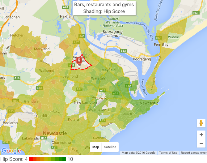
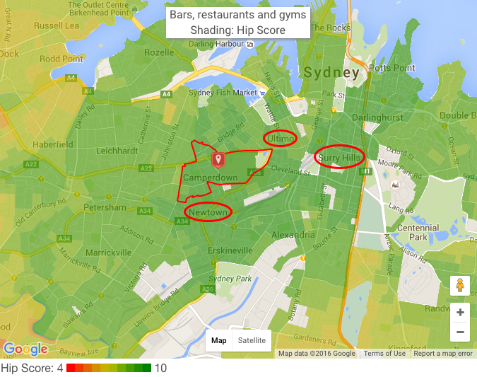
Unlike the Erskineville, Newtown, Camperdown troika, Forest Lodge stands alone at serving both families and hip people with neighbouring Glebe to its east serving hipsters and more spacious Annandale to its west providing for family.

1. Erskineville / Newtown / Camperdown

These neighbouring suburbs are all hip and serve families so well, we had to put them together for first place. Sydney’s Erskineville has a lively community with ample creative professionals, bountiful cafes and 20 art schools within 2km. Its dining options are also vast, courtesy of neighbouring Newtown. You could eat at a new Thai place every day for a fortnight.

hipsterparents1

Family score typically doesn’t accompany hip score but this sought after suburb is definitely an exception. Erskineville public school gets top 8% in NAPLAN.

It’s not so great in terms of tranquillity though, having 9 times Sydney’s average population density. For a bit of space, look the sprawling Sydney Park at its southern tip, which makes for an excellent respite to densely packed inner city living.

Our Official Top 20

Rank Suburb Family Score Hip Score Median House Price 2016
1 Erskineville 8.2 8.9 $1,315,000
2 Camperdown 8.4 8.7 $1,352,500
3 Bondi 8.6 8.5 $2,555,000
4 Newtown 8.1 8.9 $1,301,000
5 Forest Lodge 8.4 8.6 $1,680,000
6 Centennial Park 8.9 8.1 $2,650,000
7 Wollstonecraft 9.3 7.7 $3,537,500
8 Neutral Bay 9.5 7.5 $1,750,000
9 Queenscliff 9.2 7.7 $1,610,000
10 Cammeray 9.7 7.1 $4,050,500
11 Stanmore 8.7 8.1 $1,570,500
12 Waverton 9.4 7.5 $4,750,000
13 Paddington 8.6 8.2 $1,700,000
14 Fairlight 9.6 7.2 $1,583,500
15 Bondi Beach 8 8.8 $2,990,000
16 Newtown 7.8 9 $1,301,000
17 Cremorne 9.5 7.3 $1,947,000
18 Rushcutters Bay 7.8 9 $2,562,500
19 Bronte 9.1 7.7 $3,010,000
20 North Bondi 8.9 7.9 $2,550,000

Microburbs Report – Family Score

The Family Score panel of each microburbs report includes the performance of all classes of local schools, along with catchment boundaries and travel times. For a limited time, we’re offering a comprehensive family scores report for all Australian suburbs, which we can send you instantly:

Oh no...This form doesn't exist. Head back to the manage forms page and select a different form.

For press enquiries about this article, please call Microburbs Founder Luke Metcalfe on 0414 183 210.

Australia’s Top Suburbs for Your Family

Nothing’s more important than family. Much is made of capital growth and other financial factors, but many members of the Microburbs community are simply looking for a safe, happy home for themselves and their children. Convenience, hipness and lifestyle can take a back seat compared to a good environment for your kids to grow up in.

The Microburbs family score is a major statistical undertaking, involving several areas which are weighted and combined to give a final number. NAPLAN rankings of nearby schools are considered, for private options as well as government school catchments. Family amenities are considered, like parks and swimming pools. There are demographic considerations to check if there are young families in the area and if they’re mostly moving in or desperate to get out. Lastly, we undertake surveys to validate that our algorithms and data models reflect the way real families feel about types of areas.

Now that you’re an expert on the science of family scores, let’s explore Australia’s biggest cities for the top ranked suburbs for families.
 

Sydney

Sydney has around 200 suburbs with Family Score of 10, and a city average of 8.3. That may seem like a lot of family burbs, but remember Sydney is a sprawling metropolis with over 650 suburbs. The top of the top scorers are in the North Shore and Northern Beaches areas, and certainly come at a price. The average of the median house prices in our top 10 family areas for Sydney is around 2 million dollars – more than double the already steep citywide median price.

Rank Suburb Family Score
1 South Turramurra 10
2 Willoughby East 10
3 St Ives Chase 10
4 Beecroft 10
5 Middle Cove 10
6 Balgowlah Heights 10
7 Castlecrag 10
8 North Balgowlah 10
9 Curl Curl 10
10 Naremburn 10


Melbourne

Melbourne has 94 suburbs with family score 10. The citywide average for family score is 8.1, trailing Sydney only slightly. As with Sydney, however, the city’s top family burbs come at a premium, with the top 10 averaging a cool $1.5 million median price. Most of the top scorers are in the inner East or North East, with the exception of coastal Beaumaris.

Rank Suburb Family Score
1 Alphington 10
2 Beaumaris 10
3 Camberwell 10
4 Eaglemont 10
5 Balwyn 10
6 Blackburn 10
7 Ivanhoe East 10
8 Ivanhoe 10
9 Mont Albert North 10
10 Surrey Hills 10


Brisbane

Brisbane lags the other state capitals somewhat in the family score stakes. There are 40 suburbs in Brisbane with a family score of 10, which is plenty to choose from, but nowhere near Melbourne’s 94 or Sydney’s 200. Brisbane’s average family score, at 7.8, also lags behind the other big cities. Still, the differences are slight, and Brisbane is still a great city for families with lots of exceptional family suburbs.

Rank Suburb Family Score
1 Bardon 10
2 Fig Tree Pocket 10
3 Chelmer 10
4 Graceville 10
5 Ashgrove 10
6 Chapel Hill 10
7 Seven Hills 10
8 Pinjarra Hills 10
9 Pullenvale 10
10 Upper Brookfield 10


Perth

Perth scores very well across the board for Microburbs family score. There are 65 suburbs in Perth with a top family score, or around a quarter. The citywide average is a family score of 8.2, which means you can’t go too far wrong in terms of locating your family in Perth. With rents having dropped 13% in Perth, there’s a lot to recommend it for the relocating family. Our top burbs for families mostly line the river, with Cottesloe, Swanbourne and Dalkeith on the North side and East Fremantle, Alfred Cove, Rossmoyne and Mt Pleasant on the South.

Rank Suburb Family Score
1 Floreat 10
2 Wembley Downs 10
3 Swanbourne 10
4 Dalkeith 10
5 Nedlands 10
6 Alfred Cove 10
7 Claremont 10
8 Mount Pleasant 10
9 Cottesloe 10
10 Rossmoyne 10


Adelaide

In total, there are 49 Adelaide suburbs with the top family score of 10, against a respectable city average of 8.0. With the exception of Heathpool and Marryatville in nearby City of Norwood, the top family burbs of Adelaide are found in the affluent Inner Eastern City of Burnside area.

Rank Suburb Family Score
1 Tusmore 10
2 Mount Osmond 10
3 Heathpool 10
4 Marryatville 10
5 Hazelwood Park 10
6 Leabrook 10
7 Linden Park 10
8 Burnside 10
9 Beaumont 10
10 Toorak Gardens 10


Regional Recommendations

Some honourable mentions are the Sunshine Coast in Queensland, Central Coast in NSW and Bellarine Peninsula in Victoria. All are regional coastal areas near the state capital which, on average, score higher for families than the capital. If you’re looking for a family area and frustrated with the big smoke, these may be regions to explore.


Microburbs Report – Family Score

The Family Score panel of each microburbs report includes the performance of all classes of local schools, along with catchment boundaries and travel times. For a limited time, we’re offering a comprehensive family scores report for all Australian suburbs, which we can send you instantly:

Oh no...This form doesn't exist. Head back to the manage forms page and select a different form.

 
For press enquiries about this article, please call Microburbs Founder Luke Metcalfe on 0414 183 210.

Punching Above Their Weight: Sydney’s Struggle Street Schools That Perform Really Well

The federal government’s MySchool website is a treasure trove of data about schools and how they perform. Like it or not, it’s a statistical fact that rich suburbs’ schools perform better and that educated parents have kids who, in turn, do well at school. You can see a pretty strong correlation here with Socio-Educational Advantage (ICSEA) and mean NAPLAN score:

Socio-economic advantage is not the end of the story though. There’s still plenty of variation. Some schools perform way better with the children they’re given than others. This article seeks to recognise the fantastic work of those educators and institutions.

But before we get too excited, remember that NAPLAN is just about maths and literacy. It doesn’t tell you which students are going to build the next global restaurant chain or write the next Hollywood blockbuster.  There is much more to a child’s development, and some schools have educational philosophies that aren’t conducive to strong NAPLAN results. It’s possible that some of these schools are just “teach the test” hothouses.

Regardless, maths and literacy are the foundations upon which many other skills can be learnt. We may celebrate the tech founder who drops out of university to create a billion dollar business, but you can be pretty sure that person didn’t drop out because they couldn’t read or write.

 1. Canley Vale High School

What makes Canley Vale really a standout is that on our ranking it actually beat out all the other selective schools too. That means that they did more with the local children than selective schools can do with a hand-picked intake. Something is definitely going right in this very poor south western Sydney suburb. The average income per week is just $495, yet this school ranks in the top 25% for NAPLAN across the country.

 2. Cabramatta High School

Nearby to Canley Vale is Cabramatta High School, our second top performer. The majority of the students are from a Vietnamese or Chinese background. 68% of students from here come from economic backgrounds in the bottom quarter of the state, yet the school still produce results around the state average.

3. Fairvale High School

Our next best performer is also from Sydney’s South West. If you look carefully at the faces, you may see a familiar pattern:

The high cultural priority that Asian families place on education may be showing up here. This may be why high schools in immigrant areas beat primary schools. It’s a tough call for immigrant primary school children to outperform their peers while also learning a new language.

4. Chifley College Shalvey Campus

Despite 26% being from an indigenous background, 25% being from a non-English speaking background and 83% of their students in the bottom quarter of the state socio-educationally, this public high school manages to achieve NAPLAN results in line with national averages.

5. Sydney Distance Education High School

We tried to make this article about what schools that outperform, though it seems having Asian kids extends the pressure to perform into the home. Also Asian parents may be particularly keen on conventional measures of academic achievement over most extra-curricular pursuits that we don’t cover here.

So we also looked for the school that performs the best with an English speaking population and this one came top. Although the name sounds like it might be for isolated, remote families, it actually supports on children with special needs, like the pregnant or disabled. Their NAPLAN scores show that they are certainly coming through for their students.

Microburbs Report – Family Score

The Family Score panel of each microburbs report includes the performance of all classes of local schools, along with catchment boundaries and travel times. We also have available a full report for Australian suburbs, which we can send you instantly:

Oh no...This form doesn't exist. Head back to the manage forms page and select a different form.

 
For press enquiries about this article, please call Microburbs Founder Luke Metcalfe on 0414 183 210.