
The numbers everyone quotes are the wrong ones.
A suburb median blends streets moving in opposite directions, and an asking price is a hope, not a value. See the number that actually holds up. Type a suburb or address. Or ask a question.
Free sample, no signup: Bondi suburb report · 15 Rengor Close property report

Almost every property decision starts with the wrong two numbers.
The suburb median and the asking price. They are the easiest numbers in the country to find, and neither of them answers the question you are actually asking. One describes a whole suburb instead of the home in front of you. The other describes what a seller wants instead of what a home is worth.
The suburb median
A suburb is not one market. Streets inside the same suburb move in opposite directions, and the median blends them into a single number that describes none of them. Homes on the same street move together 96% of the time. Across a whole suburb it is 61%.
The asking price
An asking price is a hope. A seller and their agent set it before the market has answered, and nothing tests it until someone pays. It is a starting position, not a value, and it is the number most buyers anchor to anyway.
The wider the area, the less the number means.
We measured how often homes at each level move the same direction. A national figure agrees with the home in front of you 13% of the time. A suburb median, 61%. Only at street level does the number describe the thing you are buying.
Price agreement: how often homes at each level move the same direction. Street-level patterns explain 96% of price moves, far more than the suburb average. Read the paper →
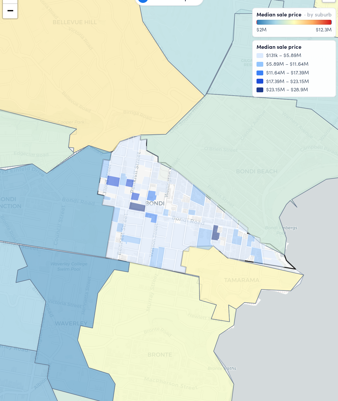
One median. Dozens of different markets underneath it.
This is one suburb, broken into microburbs and coloured by what homes actually sell for. Every block inside the outline carries the same suburb name, and the same suburb median. The median is the average of all of them, which makes it the right answer for none of them.
A number you can check, and the research behind it.
We do not ask you to take a better number on faith. Each one below has a published paper behind it, tested against sales that already happened, and you can read the lot.
Our valuation lands within 10% of the eventual sale price about 87% of the time, tested on 182,517 homes under $800,000 that sold between 2020 and 2025. Read the research.
Comparable sales matched on 30 features, not just the bedroom count. That is what makes a valuation about this home rather than about the suburb. See the method.
Top-ranked streets beat the wider market by about 7% a year (2014-2026), and our suburb forecasts score a 79% hit rate across 876,000 past calls over 12 years. Street research · Suburb forecasts.
Built on everything, not one feed
353,728 streets and 14,069 suburbs, from 25 years of Australian sales and 100+ data sources. Sixteen measured risks per suburb sit alongside the price, because the things that drag a street down are not in any median either.
Tested in the open, including against the bots
Every claim on this page has a paper behind it, and we publish the ones that put our own work on the line. How our street forecasts compare with the general AI models, head to head.
About 1 in 3 listings hide the price. We show it anyway.
A price is withheld to make you enquire, which leaves you negotiating without the one number the other side already has. We work it out and show it, so you already know the number before you enquire.
Stop deciding on the suburb average.
Read a complete report free before you pay, street forecasts and all. Then subscribe for every suburb in Australia.
“What I was missing with so many things was street level data.”— Neil Casey, Buyers AgentSubscribe nowRead the research first
A valuation prices a property. A forecast predicts a street or suburb.
They answer different questions, so we keep them separate. One tells you what a home is worth today. The other tells you where a street or suburb is heading.
Valuation, for a property
What this specific home is worth right now. Within 10% of the eventual sale price about 87% of the time, tested on 182,517 homes under $800,000 that sold between 2020 and 2025.
Forecast, for a street or suburb
Where values are heading next. Street-level patterns explain 96% of price moves, and our suburb forecasts score a 79% hit rate across 876,000 past calls over 12 years.
We publish a paper to back every claim.
Since 2014 we have tested what actually drives Australian property growth, then built each finding into the platform. Every number on this page has a paper behind it, and you can read the lot.
Market Cohesion
Street-level patterns predict 96% of price moves, far more than the suburb average.
Read the research →Suburb Forecasts
876,000 forecasts tested across 12 years of real Australian sales.
Read the research →Growth Signal Research
20 data-driven thresholds tested across 25 years of property sales.
Read the research →Distressed Properties
How we find listings priced well under what a home is actually worth.
Read the research →Comparable Sales
Comparable sales matched on 30 features, not just the bedroom count.
Read the research →Forecasting vs AI
How our street forecasts compare with the general AI models, head to head.
Read the research →Homes on the same street move together 96% of the time.
Price agreement: how often homes at each level move the same direction. The suburb average hides it. Read the paper →










What investors and agents actually say.
Direct quotes from customers on how they use the platform. Real names, real desks.
“This is what I was trying to do, get to a point where we use one tool rather than four. And that is great.”

“What I was missing with so many things was street level data.”

“The valuation is amazing. CoreLogic sits around 13% out, yours is around 6%.”
“It gives our clients so much certainty. Independent data, quantified, and real peace of mind.”

“So much better than leaning on multiple websites for public housing, flood zones and the rest.”
“The projection, the prediction thing is really, really good, which no other tool does that.”
“I do think it is going to give me an edge, the kind of detail that makes me stand out.”

Common questions
The things people ask before their first report.
What data does Microburbs actually give me?
Street-level detail for every Australian suburb: median house price, median rent, 10-year growth, renter percentage, and rental and sales turnover — plus demographics, schools, transport, and flood, bushfire and other risk mapping. Street-level means you can find the streets with 8% renters inside a suburb averaging 35%.
Where does the data come from?
We gather it ourselves. Our own database holds more than 90 million property listings, collected first-hand rather than bought in — which is what lets us go all the way down to street level and refresh it every week.
How often is it updated?
Median prices and growth forecasts weekly, every Monday. Property listings daily. Demographics annually, aligned with ABS releases. Risk maps as councils and government sources update them. Most competitors update monthly.
How accurate is the growth forecast?
The annualised growth forecast has an 85% success rate across 15 years of backtesting and more than 180 monthly tests. When we predict a suburb will beat the 7% national average, we are right 85% of the time. Our top picks have historically returned 14.8% compound annual growth over four years.
Why are your median prices different from other property sites?
We use a Smart Median — a hedonic model that accounts for capital improvements, market timing and property mix. A simple median is just the middle sale price, which skews whenever only expensive or only cheap properties happen to sell that period. Ours reflects the typical property in a suburb, which often means a lower but more accurate number.
Is there a free trial?
Not a traditional trial. A free account gives you access to every product but not all of the data. Monthly plans can be cancelled at any time, so you can test for a single month at full price with no lock-in. You can also buy individual reports without a subscription: $49 for a suburb report, $39 for a property report.
More questions? Read all 50+ answers.