Know what is going up next to a home before you bid on it, and what that kind of building has done to growth.
 By Luke Metcalfe · Founder, Microburbs Research
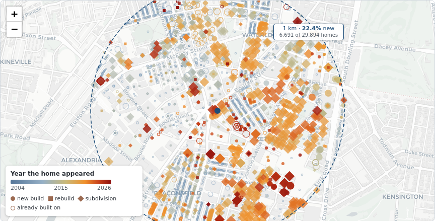
Every one of them, counted and dated, for any suburb in the country. Not a sample, not the capitals, not the suburbs someone chose to cover. Every home in Australia sits on the map with the date its address was first recorded, so you can see exactly what has gone up around any address and roughly when.
Addresses as at the April 2026 national release, the most recent available. We refresh it as each release lands.
Where you will see this. It is going into Microburbs suburb reports, so the map sits on the suburb you are looking at.
Yes. Across the country the gap is 2.8% a year. Mapping it is the first half. The second half is what it does to your money, and that is where the kind of building matters more than the amount.
Across the 4,912 Australian suburbs (of 15,026) that added at least 100 homes since 2016, the ones where at least half the new homes were apartments ran 2.8% a year behind the ones where it was mostly houses, from 2016 to 2026.
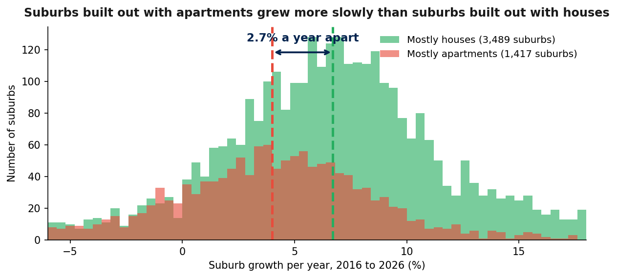
Sort those suburbs by how much building they added and the growth gap between the busiest and the quietest is about 1% a year. Sort them by what was built instead, houses against apartments, and the gap is nearly 3% a year. The kind matters about three times more than the amount.
What that is worth. A $650,000 home in a suburb built out with houses grew to about $1,244,000 over ten years on these numbers. The same $650,000 in a suburb built out with apartments reached about $963,000. That is $281,000 of difference on one purchase, from the kind of building going up nearby.
Two suburbs to make it concrete. They illustrate the split, they are not the evidence for it, which is the whole-country comparison above and the matched suburbs below.
Mostly apartments: Docklands, Melbourne. Same decade and a similar amount of building as Tarneit, but almost all of it apartments.
Mostly houses: Tarneit, Melbourne. A similar amount of building, but houses on new land instead of towers, 2016 to 2026.
The same pair shows up in Sydney. Zetland is three quarters new and nearly all apartments. Schofields had a similar volume of building, mostly houses. The research impact is the 2.8% a year group gap above, not either suburb's own growth.
It depends entirely on what the land turns into, which is why the kind of building is the thing to look at. Before you bid, look at the map for the address you are buying. Ask what kind of building is going up nearby, not just how much. A lot of building is not automatically bad. A lot of apartment building is the thing that has gone with weaker growth.
Six things the research paper settles, including findings that go the other way.
Our research maps every new home in the country. Look up the suburb you are watching to see how it stacks up.