Market Cohesion B-Roll
Animated GIFs for the video. White background versions of each B-roll visualisation.
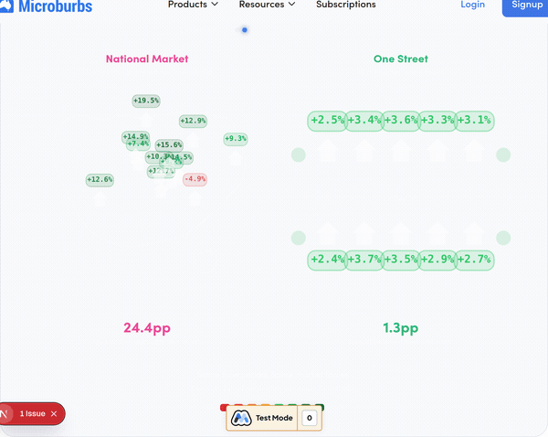
Map vs Street
Australia with scattered houses showing wildly different returns, vs a single street where returns cluster tight.

Map Zoom
Concentric rings narrowing from national to street level. Properties cluster tighter as the ring shrinks.

Cohort Circles
Dashed circles group properties in the same cohort. Arrows show whether each beat or missed the median.
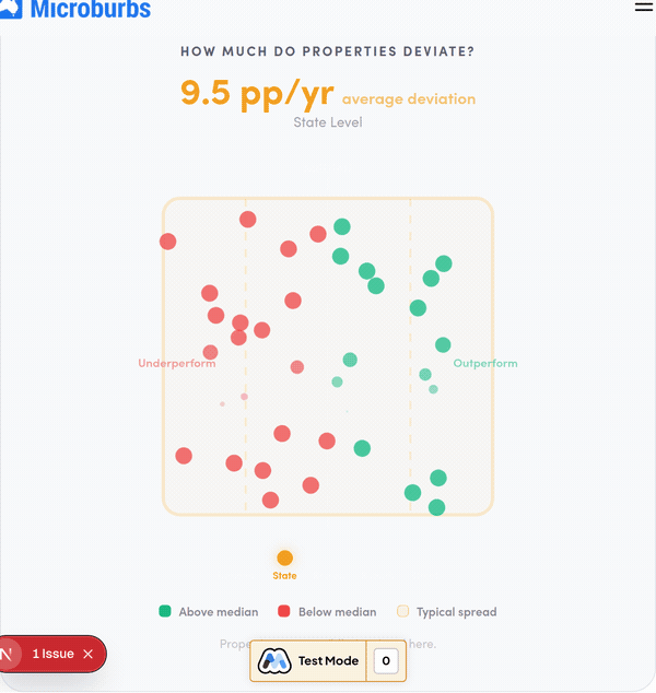
Deviation Funnel
Mean absolute deviation shrinks from 10pp/yr (national) to under 1pp/yr (street). Dots narrow into a tight band.
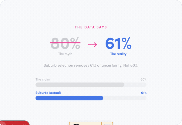
80% Myth Buster
The classic "80% heavy lifting" claim gets crossed out. The real number: suburbs do 61%. Streets do 89%.
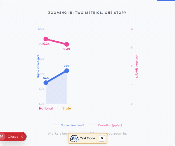
Dual Axis Chart
Same-direction percentage rises on the left axis while deviation falls on the right. Two lines, one story.

Summary Waterfall
Uncertainty removed builds up level by level: 24% (national) to 89% (street), with verdict badges.