The top picks from our two-year house forecast have beaten the national average by about +7.3% over the following two years, worth roughly $61,000 more growth on a $750,000 house, with 8 in 10 of the suburbs we picked ahead, across all 132 monthly rounds between 2013 and 2024, on data the forecast never saw. Here is the track record.
 By Luke Metcalfe · Founder, Microburbs Research
Which suburbs will grow faster than the ones around them? Everyone has an opinion. Very few can show that their picks actually beat the local market, year after year, on suburbs they chose before the growth happened.
We can. The Microburbs forecast scores suburbs right across Australia for how much they are likely to grow over the next two years. We went back to 2013, gave the forecast only the information available at the time, and checked what its top picks did over the following two years against the national average. Then we repeated that test every single month, 132 rounds, right through to 2024. The same forecast is live today, predicting 2024 to 2026 and 2026 to 2028 on every suburb report.
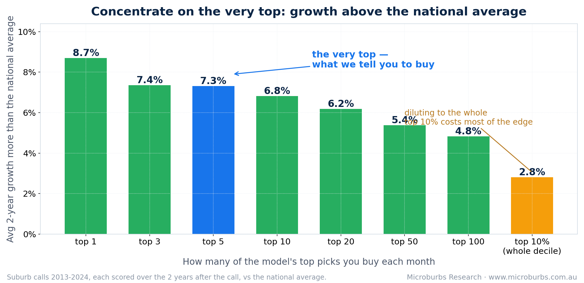
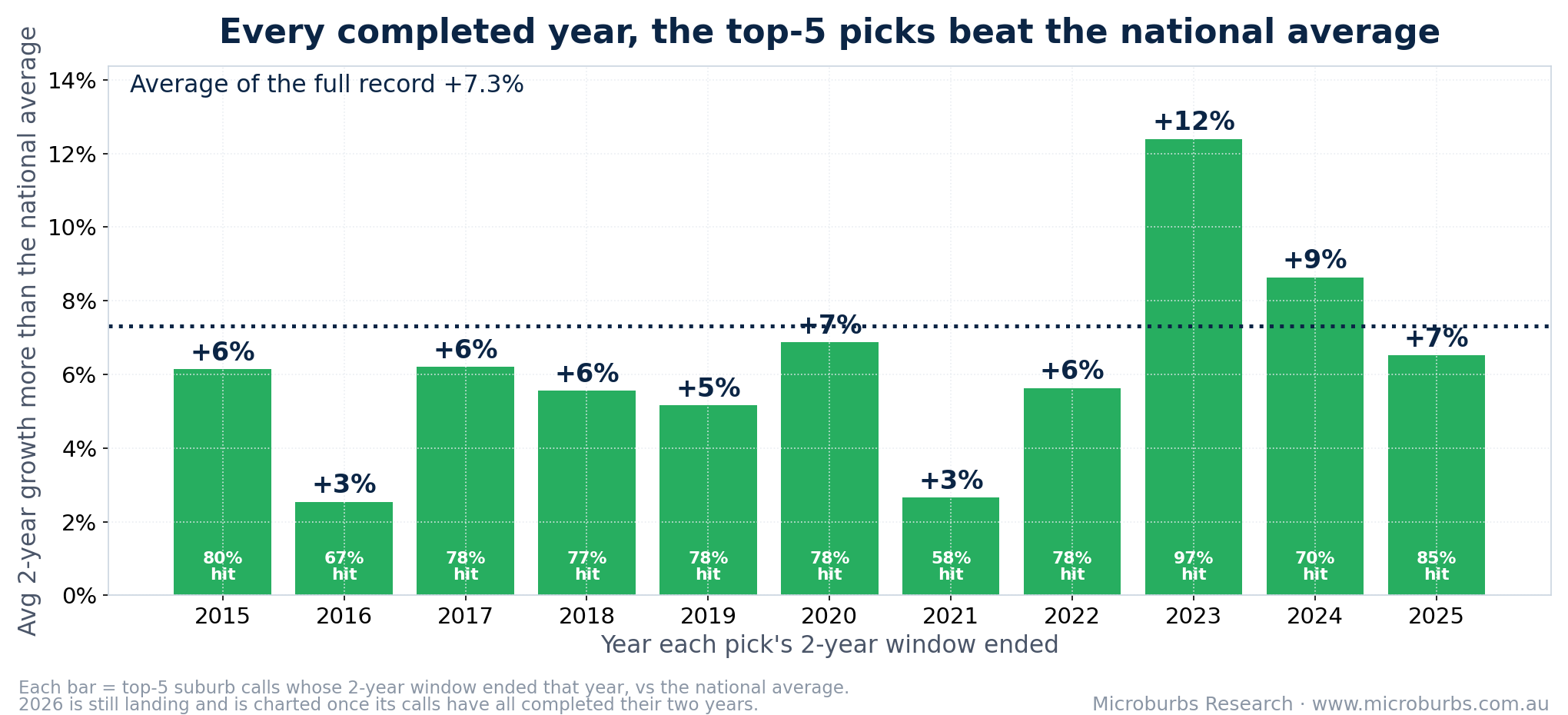
This is the heart of it. The forecast's top picks beat the national average by about +7.3% over the following two years, and they did it in every completed year we tested, 2015 through 2025. That is a few per cent a year of edge that shows up round after round, not a one-off tip. A repeatable edge is what matters over an investing lifetime: it is the difference between a good decade and an average one. Realising it means acting on the forecast each cycle, with the buying and selling costs that implies, so treat it as a steady edge to build a strategy around rather than a fixed return we are promising. (In the fine print, it pays to take the small handful at the very top rather than the whole top 10%: the top five sit near +7.3% while the diluted tenth is about +2.8%, and within that top handful the ordering is noise.) And buying takes time, so we checked: wait three months after the call and buy the same picks, and they still beat the national suburb index by about +7.7% over the following two years. You do not have to move on the day. In fact a list holds up for about three months, a shortlist that age performs as well as a freshly-refreshed one. After that it starts to fade: by around six months the edge is noticeably weaker, and by a year it is roughly halved. So there is no penalty for taking a few months, but if your shortlist is older than that, reopen the suburb report and take today's picks.
That edge was not a one-off. +7.3% over two years is about +3.6% a year of extra growth. In dollars: over a typical two-year window in the test, the suburb price index we score against averaged about +13% growth across all scoreable suburbs, while the top five picks grew about +21% in total. On a $750,000 house that is roughly $161,000 of growth against $100,000 for the typical suburb, about $61,000 more. And the edge showed up in every completed year: picks whose two-year windows ended in 2015 through 2025 all came out ahead of the national average, from about +2% to +10%, through the 2018 slowdown, the pandemic and the 2022 interest rate rises. The freshest completed year is the strongest recent proof: windows ending in 2025 finished +9.6% above the national average, with 53 of 60 picks ahead. The average edge was positive in all 11 markets we tested, from Sydney (+5.3%) and Melbourne (+5.1%) to regional Queensland.
The fair objection, answered. The years we could test, 2013 to 2024, contain no nationwide downturn. Prices fell in some cities and rose in others across that span, and the forecast came out ahead in all 11 markets through those swings, but it has never been graded through a fall across the whole country, because there has not been one inside the window our records cover. So use this to pick which suburbs lead, not as protection if the entire market turns. We will publish the result either way when the next downturn gives us one.
See all 132 monthly rounds →
The proof of the edge is the suburb-level record above, across hundreds of calls. A single property is a different matter: its price turns on its own condition, its street and plain luck as much as on the suburb, so the suburb's few-per-cent edge is swamped by noise in any one sale. We checked this honestly. Across the resales we could match to a top-five call and a same-market control, only about half beat their market, and equal-weighted across suburbs the median property edge was roughly zero. So we do not claim the individual sales prove outperformance. They cannot, and more than 1 in 7 resold below the purchase price, because a good suburb call does not rescue a bad buy. What the two purchases below do is make the suburb calls concrete: real, established houses in suburbs the model rated a top buy, verified un-renovated, that then rose while their market rose less.
Two of those purchases, checked against dated street photography and aerial imagery to confirm nothing was renovated between the buy and the sell:
We built this forecast the way the best stock market models are built. It learns from years of history, then we test it by making it predict years it was never shown. In markets you cannot look clever in hindsight. You have to prove it on data the model has never seen. That is exactly the test on this page.
The forecast hunts for value. Its biggest single signal is easy to state. It looks for good suburbs that have fallen behind similar suburbs and are due to catch up. Around that it compares each suburb with comparable ones, studies the shape of millions of price histories. Prices are where supply and demand leave their mark, so the model reads them there rather than counting listings or cranes directly. Tightly held areas with little new building tend to show it in their price behaviour, and it is the price behaviour the model sees.
It plays a relative game. It does not try to guess interest rates or what is happening overseas. It aims to pick the suburbs that will beat the rest of the country by a few per cent a year. Share traders call that edge the alpha. We measure it against the national average because that is the real choice in front of a buyer: buy the pick, or buy something typical somewhere else. A buyer cannot hedge away what his own city does. As a harder skill check we also scored every pick against its own city or regional market, and the top five still won, by about +7.4% with 83% of calls ahead, so the edge is suburb picking, not just riding hot cities. One honest caveat: our test years were mostly rising markets, and this record measures which suburbs lead, not what the whole market will do next. Treat the forecast as a guide to which suburbs lead, not as protection in a downturn.
The most common question we get: does this account for public housing, or a new train line, or a rezoning? The honest answer is not directly. What we tested here is the two-year house forecast, scored directly from the production forecast's own monthly files. The unit forecasts and the four-year forecast were not part of this test. And it is a market timing forecast: its job is reading market trends through price behaviour, where supply and demand leave their mark, and picking which suburbs are placed to lead. Big local changes tend to reach any market forecast only as they start moving price behaviour.
So use it for what it is good at: telling you which suburbs are placed to lead their market, and when. Then vet the suburb like a buyer. The rest of its Microburbs report covers what this forecast does not: public housing, flood and bushfire risk, crime, schools, noise and more. The forecast finds the wave. The report checks the water.
Two more honest notes. First, many of the model's strongest calls are small places: about half the top-five calls in our record were localities with under 1,000 residents. Run the same test only on suburbs with 5,000 or more residents and the top five still win, just by less: about +4.6% over the two years, with 73% of calls ahead. Bigger suburbs, steadier but smaller edge. Every suburb report shows the population. Second, the rounds are monthly but each is judged over two years, so the windows overlap: the span holds about six fully separate two-year periods. We checked that this is not doing the work: buy only every 24 months, on any starting month you like, and all 24 versions of that plan still came out ahead of the national average, the weakest by +4.6% over two years.
You might expect the forecast to also tell you when to sell. We tested that, and it does not hold up. When the model turned negative on a suburb it had earlier rated a top buy, that suburb went on to beat the national average by about 1% over the next two years, not fall behind it. In other words the sell signal fired too early: those suburbs still had momentum. Marsden Park (Sydney) is the clearest case, holding it from 2014 to late 2025 returned about +192%, while following the model's exits returned about +76%. So treat this as a buying tool. The proven skill is spotting which suburbs are about to outperform, not calling the top.
The full sell-signal test →
Here are strong, recognisable calls the forecast made, each shown as the buy call and the two years the model is scored on, with a couple of years of context either side. The blue line is our price index for the suburb; the dashed line is its capital city on the same basis, so the breakaway is visible. Each is an established suburb, not a tiny town whose prices swing on one project. For Maslin Beach and Holt, real settled sales confirm the move; the Rosanna chart is our price index.
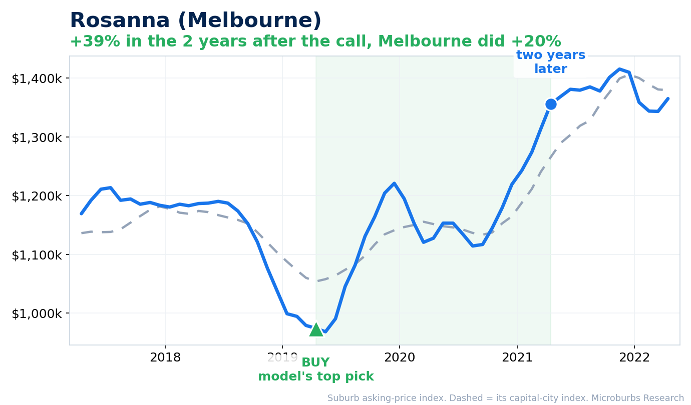
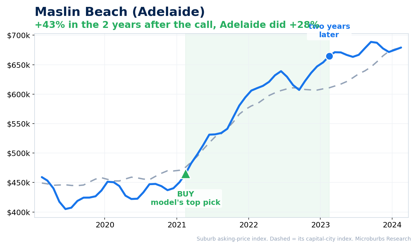
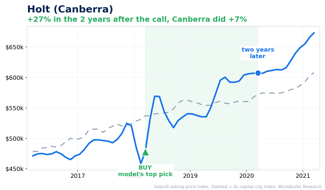
The blue line is our suburb price index (asking prices toward the dearer end of the market); the dashed line is its capital-city index on the same basis. Each chart marks the green ▲ BUY where the forecast made the suburb a top pick, then the blue dot two years later, the horizon the model is scored on, with a couple of years of context either side. Each suburb is drawn against its own city. The headline record is measured against the national average. Analysis as at June 2026; price data runs to November 2025.
| Suburb | Growth vs its city | City | What the model did |
|---|---|---|---|
| Rosanna | +39% while Melbourne did +20% (2019 to 2021) | Melbourne | Made the national number-two pick in April 2019, near a local low |
| Maslin Beach | +43% while Adelaide did +28% (2021 to 2023) | Adelaide | Rated a top pick in February 2021, then broke away from the Adelaide market |
| Holt | +27% while Canberra did +7% (2018 to 2020) | Canberra | Rated a top pick in March 2018, at a dip |
These three suburbs are illustrations, not the whole proof. The proof is the concentration curve and the year-by-year record above, which cover 800,211 scored outcomes across 6,318 suburbs, not a handful chosen with hindsight. We picked strong, recognisable, established suburbs, not tiny mining towns whose prices swing on a single project.
See all the example suburbs and the data behind them →
The national top-five list is built to find the best value anywhere in the country, so in any given month it often sits in cheaper regional markets. Over the whole record, a Sydney suburb made the national top five in only 37 of 132 months. That does not mean the model is no use to a Sydney buyer. Run the same idea inside Sydney alone, ranking Sydney suburbs against each other each month, and the top five still worked: they beat the rest of the Sydney market by about +3.9% over the following two years, ahead in 8 of every 10 calls. The same holds in every capital. So a single-city buyer uses the forecast to rank within their city, not to wait for their city to top the national list.
Think of the forecast as a shortlist tool. Instead of guessing across thousands of suburbs, you start with the handful most likely to beat the national average, then spend your weekends and your research where it counts. If you are a buyers agent, this is a track record you can put in front of a client, with 132 monthly rounds of testing between 2013 and 2024 behind it rather than a number from nowhere.
The forecast is not a crystal ball. The edge is steady rather than spectacular, it tells you which suburbs are likely to beat their neighbours rather than promising any one will grow by a set amount, and it reads two years ahead, not the exact top or bottom. Used as a shortlist of the very top picks, refreshed as the list refreshes, that steady edge adds up across the buys you make. It is a two-year edge you can repeat, not a promise that any single pick keeps outperforming for a decade.
Want to know what the forecast says about a suburb you are watching right now? Every Microburbs suburb report carries its current growth forecast. Check your shortlist before your next inspection.
What buyers and agents should do with this →
This was put together by Luke Metcalfe and the Microburbs Research team. We tested the forecast across more than 800,000 suburb checks spanning 2013 to 2024, on data it had never seen, measured against the national average of all suburbs, and cross-checked against each suburb's own market, the five mainland capitals plus the regional markets of each state, 11 markets in all. The full method and every chart are in the research paper.
I am Luke Metcalfe, who built the forecast. Once you have judged the proof for yourself, book 30 minutes and I will go through what it says about the suburbs you are weighing up.