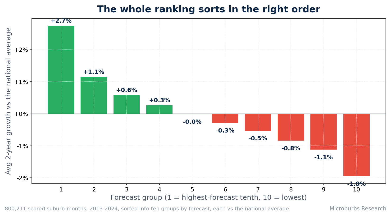
The top picks from our two-year house forecast beat the national average by about +7.3% over the following two years, with 82% of scored suburb calls ahead, across all 132 monthly rounds between 2013 and 2024 on data the forecast never saw. Here is the scorecard.
 Luke Metcalfe, Microburbs Research. Updated June 2026.
Every property data company claims its growth forecast works. Few show the evidence. This paper does. We took the suburb growth forecast that powers Microburbs suburb reports, replayed it every month, 132 rounds, from 2013, and compared what it predicted against what each suburb actually did over the following two years, measured against the national average.
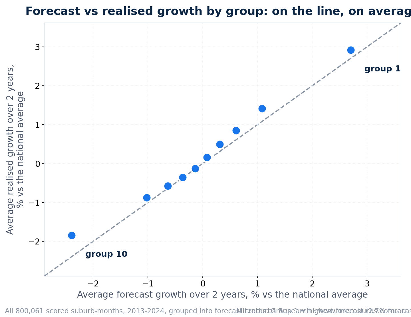
The record is computed from the production forecast's own monthly files, suburbs only: 800,211 scored suburb-months across all 132 months, every mainland state and the ACT. At each point in history the forecast only saw data available at that time, so this is an out-of-sample track record, not a curve fitted after the fact. The same forecast is live today, predicting 2024 to 2026 and 2026 to 2028 on every suburb report.
A growth forecast is only worth acting on if its best calls genuinely outperform afterwards. The honest way to check is to step back in time, take only what was known then, rank every suburb, and watch what happened next. Throughout this paper, headline growth is stated relative to the national average, defined as the average two-year growth of every scored suburb in that month's files, between 5,105 and 6,318 suburbs each month, spanning every mainland state and the ACT, over the same window. That is the benchmark that matches a buyer's real decision: buy the pick, or buy something typical somewhere else in the country. A buyer cannot hedge away what his own city does, so an edge over a market he cannot avoid holding is not money in his pocket; an edge over the nation is. As a harder cross-check we also score every pick against its own market, its capital city for metropolitan suburbs or its state's regional market otherwise, 11 markets in all. That check strips out the easy points a booming capital hands out, and the top five still won it, by about +7.4% over two years with 83% of calls ahead and 126 of the 132 monthly rounds positive. The edge is suburb picking, not geography.
The forecast is built and judged the way a serious quantitative stock market model is built and judged. It learns from history, then it is validated out of sample by predicting periods it never saw. In markets you cannot claim skill after the fact. You have to demonstrate it on unseen data. The walk-forward test in this paper is that demonstration.
Its dominant signal is mean reversion. It looks for suburbs that have underperformed comparable areas and are positioned to revert. Around that it compares each suburb against similar suburbs, learns from the shape of millions of price trajectories. Its fitted inputs are price-history measures: supply, demand and turnover are not fed in directly, but they leave their mark on price behaviour, and that is where the model reads them. Tightly held, low-turnover areas tend to show the pattern in their prices, which is what the model sees.
It is a relative model by design. It does not forecast the macro economy. Global shocks and interest-rate cycles are deliberately left out. The target is relative performance, which is how far a suburb will beat or lag the rest of the country. In market language it seeks alpha, a few per cent a year of outperformance over each two-year window. That focus is why the edge stays positive across booms, the 2018 downturn and the 2022 rate shock. The evidence is for that repeated two-year edge, not for holding a single pick for ten years, and our own tests show a pick's advantage fades within months, so the value is in acting on the current list, not buying once and waiting.
The single most important result is the gap between the very top of the list and the diluted top tenth. The five suburbs the forecast ranks highest each month beat the national average by about +7.3% over the next two years. Spread the same idea across the whole top 10% of suburbs and the edge falls away to about +2.8%. The practical message for a buyer is to take the very top of the list, not the whole top tenth. Fine differences within that top handful are not stable, and should not be over-read: across the 24 non-overlapping buying calendars, the single top-ranked pick beat the top-five basket in 18, and the top five beat the top ten in 18. What held in every calendar is the top handful beating the national average; the chart's message is the cliff down to the diluted tenth, not the pecking order among the first few bars.
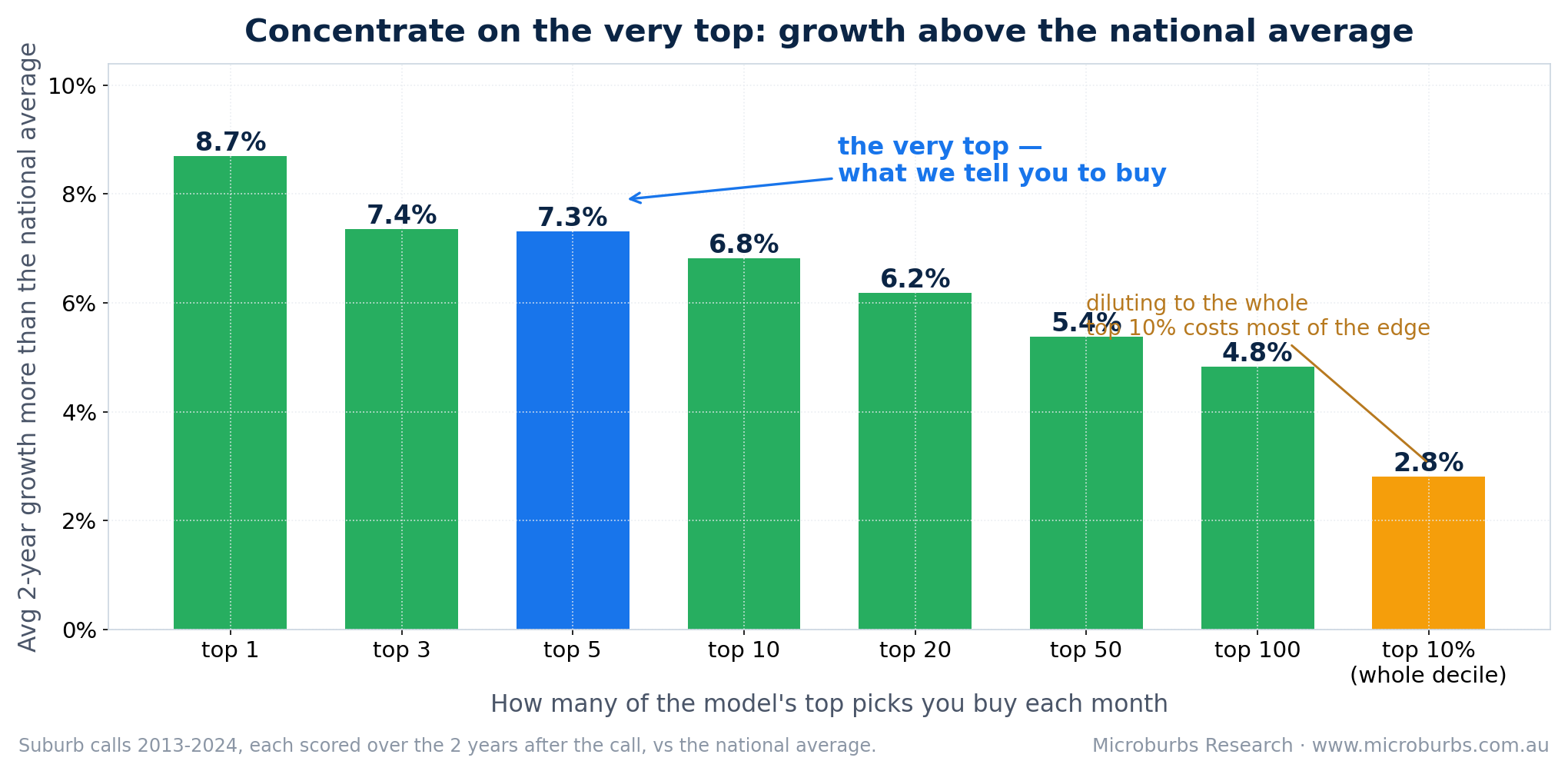
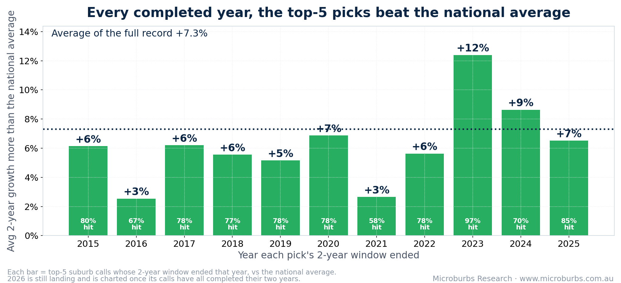
The signal is consistent rather than spectacular. A steady few per cent a year over the national average, showing up round after round, is an edge you can act on repeatedly. It is not a lottery ticket, and it is not a promise that one pick keeps winning for a decade.
| Market | Top-5 calls that landed there | Their growth vs the national average |
|---|---|---|
| Canberra | 10 | +12.3% over two years |
| Regional SA | 27 | +9.9% over two years |
| Regional NSW | 87 | +9.0% over two years |
| Brisbane | 42 | +8.7% over two years |
| Regional Vic. | 91 | +8.2% over two years |
| Regional Qld | 166 | +7.6% over two years |
| Adelaide | 85 | +6.5% over two years |
| Sydney | 44 | +5.3% over two years |
| Melbourne | 44 | +5.1% over two years |
| Regional WA | 35 | +4.0% over two years |
| Perth | 24 | +3.6% over two years |
Where the 655 scored top-5 calls landed, 2013 to 2024, and how they grew against the national average. Every market came out positive. Sydney and Melbourne carry fewer calls because the forecast found more of its best value elsewhere in those years.
It is tempting to also read the forecast as a sell signal: step out when it turns negative on a suburb it had rated a top buy. We tested that directly. Across every case where the model turned negative on a suburb it had previously flagged as a top pick, the suburb went on to beat the national average by about 1% over the next two years, and its own market by about 1.5%, not lag them. The sell signal fired too early: those suburbs still had momentum. Every one of the 24 two-year-spaced buying calendars stayed positive whether or not the exits were followed. The clearest single case is Marsden Park (Sydney): the model never turned positive on it again after May 2018, yet holding from September 2014 to late 2025 returned about +192% against about +76% for the timed path. The honest conclusion is that the proven skill is on the buy side, spotting which suburbs are about to outperform. Do not treat the sell signal as a reason to exit a winner.
Read this carefully. The forecast is a buying tool. Its sell signal did not predict underperformance in testing, so it should not be used to time exits for return. Selling remains a decision for your own circumstances, not something this forecast has shown skill at.
Numbers across hundreds of thousands of suburb-months support the pattern. Real suburbs make it concrete. Below are three strong calls, each shown as the buy call and the two years the model is scored on, with a couple of years of context either side. These are established suburbs, independently screened, not tiny mining towns whose prices swing on a single project.
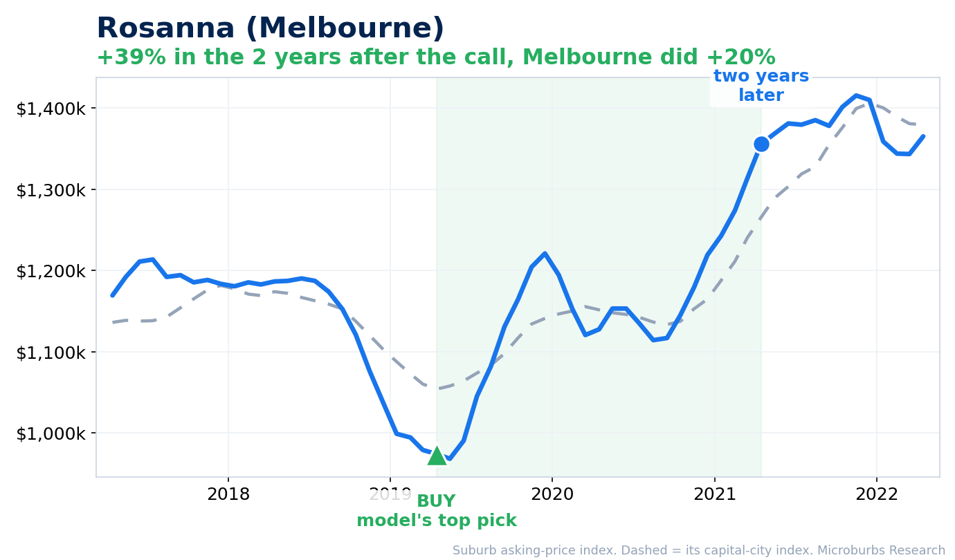
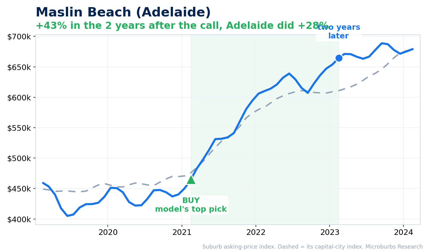
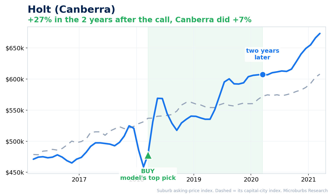
The blue line is our suburb price index (asking prices toward the dearer end of the market); the dashed line is its capital-city index on the same basis. Each chart marks the green ▲ BUY where the forecast made the suburb a top pick, then the blue dot two years later, the horizon the model is scored on, with a couple of years of context either side. Each suburb is drawn against its own city; the headline record is measured against the national average. Analysis as at June 2026; price data runs to November 2025.
| Suburb | Growth vs its city | City | What the model did |
|---|---|---|---|
| Rosanna | +39% while Melbourne did +20% (2019 to 2021) | Melbourne | Made the national number-two pick in April 2019, near a local low |
| Maslin Beach | +43% while Adelaide did +28% (2021 to 2023) | Adelaide | Rated a top pick in February 2021, then broke away from the Adelaide market |
| Holt | +27% while Canberra did +7% (2018 to 2020) | Canberra | Rated a top pick in March 2018, at a dip |
To take one example, Rosanna (Melbourne) was the model's number-two pick in the country in April 2019, near a local low. Over the two years after the call our suburb price index for Rosanna rose about +39%, against roughly +20% for Melbourne (settled sales there rose more modestly, still ahead of the Melbourne market).
The edge is a suburb-level result. At the individual-property level it does not survive the noise, and we say so plainly. Across the record we matched 188 clean resales of houses bought within three months of a top-five call and sold about two years later, spread over 60 suburbs (no claim these buyers saw a forecast; all figures are gross price change). Tested against a same-market control, only about half beat their market, and equal-weighted across suburb episodes the median property edge was roughly zero. A single property's return is dominated by its own condition, street and timing, not the suburb's few-per-cent edge, and between about 1 in 7 and 1 in 5 resold below the purchase price. So we do not present these sales as proof of outperformance; the proof is the suburb-level track record. Two of them serve only as concrete, verified illustrations, checked un-renovated against dated street photography and buy-month and sell-month aerial imagery: a house in Ashmore (Gold Coast), $1,000,000 in April 2022 to $1,175,000 in September 2024 (+17.5% against +6.4% for the national suburb index over the window), and a house in Ingleburn (Sydney), $900,000 in March 2023 to $1,165,000 in March 2025 (+29.4% against +8.3% on the same index).
The forecast estimates the capital growth a suburb is likely to record over the next two years, by reading how each suburb's prices have behaved and how it compares with similar and neighbouring areas, not the physical features of individual homes. It runs across the country and refreshes on a schedule, and it is the same forecast shown on Microburbs suburb reports.
To grade it fairly we used walk-forward testing. We rewound to a past month, gave the forecast only the data available then, recorded its ranking of every suburb, and waited two years to see what actually happened. We repeated this every month: 132 overlapping monthly rebalances from March 2013 to February 2024, each judged over the two years that follow, so the span contains about six fully independent two-year windows. Because the answer is always in the future relative to the forecast, this avoids the most common trap in this field, which is scoring a model on data it was effectively trained on. Headline outperformance is measured against the national average as defined above, the average of all scored suburbs over the same window, the alternative a buyer actually has. As a harder cross-check we also measure each pick against the average of its own market, 11 markets in all, so a forecast cannot look good simply because one city rose faster than the rest; the record is positive on both benchmarks.
Automated arithmetic cross-check. The downloadable round-level file lets you recompute the headline yourself: the +7.3% edge and the hit rate fall straight out of the per-round numbers, 536 of 655 scored calls came out ahead of the national average, and a separate automated pass reproduced +7.307% to the third decimal. This confirms the arithmetic, not the picks themselves: the public file is round-level and does not name the suburbs, so it cannot prove which suburbs were selected or that the ranking was fixed before the outcome. That selection is frozen in an internal call-level ledger with a source fingerprint; the walk-forward method, not this file, is what guards against hindsight.
Download the 132 monthly rounds (CSV): one row per round with the calls scored, the average edge against the national average over the following two years, how many calls beat the nation, and the same edge against each pick's own market. The call-level headline (+7.3%, 82%) is the call-weighted average of these rows, and 124 of the 132 rounds came out ahead of the nation. The frozen rule selected 660 calls; 655 have a scoreable outcome, because five calls in thinly traded localities have no reliable price series to score against. Suburb names are not included.
A related honesty check: because a strong suburb often stays in the top five for months, the 660 monthly selections are not 660 separate ideas. They collapse to 321 stints across 249 distinct suburbs, with 339 selections simply continuing the prior month's rating. Counting each suburb only when it first enters the top five, the 319 scored first entries still beat the national average by +5.9% over two years, with 78% ahead. The edge is not an artefact of counting the same winner month after month.
This paper tests the two-year forecast for houses. The unit forecasts and the four-year forecast were not tested here and this record should not be attached to them. The forecast models market behaviour through price histories, where supply and demand leave their mark. Its job is to say which suburbs are placed to lead their own market and when. It is not built to audit a suburb's specific circumstances, such as public housing, individual infrastructure projects, planning changes or natural hazards. Questions of that kind sit outside what a market timing forecast is for, and factors like these tend to reach any market forecast only as they show up in price behaviour, usually with a lag.
In practice it should be combined with the direct indicators on each suburb's report, which cover public housing, flood and bushfire exposure, crime, schools and related factors. The forecast ranks and times. The report vets.
Two further limits. Suburb size: about half the top-five calls in this record were localities with under 1,000 residents, where thin trading can move medians. Restricting the same ex-ante test to suburbs of 5,000 or more residents still produces a winning top five, at a smaller edge: about +4.6% over two years with 73% of calls ahead. Window overlap: the 132 monthly rounds are each judged over two years, so adjacent rounds share outcomes and the effective number of independent two-year windows is about six. As a robustness check we also spaced purchases 24 months apart so that no outcome windows overlap at all: every one of the 24 possible buying calendars stayed positive, the weakest still beating the national average by +4.6% over two years.
The edge is relative and moderate, +7.3% over each two-year window, which is about +3.6% a year for the very top picks, not a promise of riches on any single property. The individual-suburb correlation is 0.21; the value is in ranking, not point valuation.
The +7.3% headline is an average with genuine uncertainty around it. Because adjacent monthly rounds share most of their two-year window, the calls are not 655 independent trials. Accounting for that overlap (resampling whole two-year blocks of the record), the edge sits in a 95% range of about +5.5% to +8.7%. The whole range is comfortably positive, but do not read +7.3% as a precise or guaranteed figure.
The example timing follows the signal literally, so it sometimes sells before a later run. That is honest signal-following, not curated hindsight.
The price-journey charts use a listing-price index, which can overstate both gains and drawdowns compared with transacted medians.
Realised outcomes need two years of data. Windows ending in 2025 are fully scored; 2026 is still part-way through, and later calls score progressively through 2027. The forecast is live and is now predicting 2026 to 2028.
Past performance is evidence the method works, not a promise that the next two years will look like the years we scored.
For a buyer, the forecast is a shortlist tool. It narrows thousands of suburbs to the handful most likely to beat the national average, so your own research and inspections go where they count, and the evidence says to concentrate on the very top of that list. For a buyers agent, a track record like this is something you can put in front of a client with the testing behind it, rather than a number with no provenance. The right question is no longer whether a forecast number is real. It is which of your candidate suburbs the forecast currently rates among its very top picks, and why.
Read the plain-English summary →
Microburbs Research. Track record measured out-of-sample, 2013 to 2024, across 800,211 scored suburb-months, suburbs only, from the production forecast's own monthly files. Growth figures are relative to the national average over the stated period unless labelled otherwise.