Tell Suburb Finder your budget, your area and what you are after. It ranks the lot and hands back the short list worth your weekend. Watch Luke run one in six minutes.
 By Luke Metcalfe, Founder & Chief Data Scientist, Microburbs · 19 August 2026
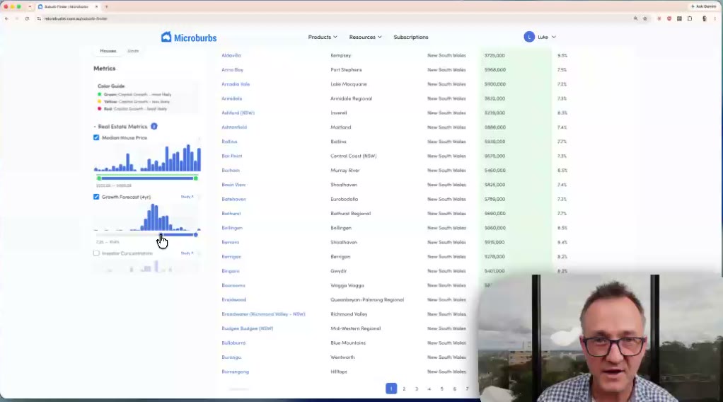
Six minutes with Luke Metcalfe, who built it. He runs a live search from a blank screen down to a shortlist, and explains what the green, yellow and red bands under each filter actually mean.
So most people buy near where they live, or near where a mate bought, or wherever the last podcast said was hot. That is not research. It is a shortlist someone else wrote for you.
The tools that do exist mostly tell you what already happened. Median price, past growth, days on market. All of it is a rear-view mirror. None of it tells you the one thing you actually want to know, which is what happens next.
The historically tested filters have a coloured bar underneath them. Green marks the range where suburbs grew faster than the national median. Yellow is about the same. Red is slower. Those bands are not somebody's opinion. Each one was tested against 25 years of Australian sales. A band only ships if the pattern held year after year, not just in the good ones.
Take public housing share. The green band sits at the low end, because that is where the sales history says suburbs did better. Low is good on that one, high is good on the growth forecast, and you never have to remember which way round any of them go. The colour tells you. You drag the slider into the green.
Where a signal stopped working, we take it out and tell you. That is why the rest is worth trusting.
Set your area, your budget, and whether you want a house or a unit. Then pick one of three strategies.
What comes back is a handful of suburbs that fit the brief, not a wall of hundreds. Every one of them has real stock on market right now, so the list is something you can act on this weekend. It is the one Microburbs tool you can export, and customers bring that up unprompted.
To make it concrete, here is a single search run in August 2026. New South Wales, houses, growth strategy, sliders in the green.
All of New South Wales. Houses, not units. Growth strategy, with public housing kept low and the risk filters on.
170 suburbs, out of roughly 14,000 in the country. Seven pages, ranked best first, and you can export the top 100 to a spreadsheet.
Median house prices on that list ran from $225,000 to $925,000 as at August 2026. Country towns and coastal towns, side by side.
That is a weekend of research done before your coffee goes cold, and a list you set rather than one somebody sold you.

The suburbs on that list are not printed here on purpose. The ranking is the thing you are paying for, and handing it out on a web page would make the subscription pointless. Run it on your own budget and your own state and you get your own list, which is more use to you than ours anyway.
These are the sliders and switches used, exactly as they appear in the tool. Each one has its own green band, so you are aiming rather than guessing.
| Filter | What it does | Set to |
|---|---|---|
| Area | Which state, region or council areas to search | All of New South Wales |
| Houses or units | Swaps every number on the page between house and unit data | Houses |
| Median house price | Your ceiling. A hard limit, not a target | Left open |
| Growth Forecast (4yr) | Our own forecast. This is the paid column | Into the green |
| Gross yield | Annual rent against the price | Into the green |
| Public housing | Share of public housing in the microburb | Into the green (low) |
| Safety | Local safety, out of 100. Higher is better | Into the green (high) |
| Unemployment | Share out of work | Into the green (low) |
| Welfare reliant | Households on government payments | Into the green (low) |
| Mortgage stress | Households already stretched on repayments | Into the green (low) |
| Bushfire and flood | Hazard rating, safe through to at risk | Safe only |
| Stock on market | Whether anything is actually for sale there now | On |
Twelve settings, one pass, 170 results. The green bands are what let you set all twelve without knowing a single cut-off.
The order of that list comes from a four-year growth forecast that no other platform publishes. That forecast is the subscription. Everything else on the page is free.
Every suburb in the country carries a Microburbs forecast for the next four years. It is built from more than twenty separate indicators and tested against decades of real sales. Not asking prices, not valuations, actual sales.
At a high level those indicators cover five things about a suburb. What property there costs and what it has done before. Who lives there and how they are doing financially. How many jobs are within reach. How much new housing is coming. And what could go wrong. The forecast weighs all five together, so a suburb that looks cheap on price alone but weak on the other four does not rise to the top.
It is right far more often than not. We test it on sales that happened after the forecast was made, not on the ones used to build it. On that test it picks suburbs that go on to beat the market roughly 85 times out of 100. Some miss. It is a forecast, not a promise, and we say so on the tool itself.
Out of every 100 suburbs the forecast picked, about 85 went on to beat the market
Each square is one suburb. Green means it grew faster than the national median over the following four years. Grey means it did not.
15 in every 100 miss. That is why the forecast is a shortlist tool and not a buy signal.
"No other platform I have seen gives the growth forecast. Or backtests it. I rely on that quite a lot." Margaret McSwain, buyer's agent, on a call with us in May 2026
A strong forecast is not enough if the suburb carries something you never checked. The risk filters take out the suburbs where a second factor eats the growth. Public housing share, safety, welfare reliance, unemployment and mortgage stress. All of them measured at microburb level, which is a pocket of a few hundred homes, rather than smeared across a whole council area. Two streets apart can be two different stories.
Each of those has a measured effect on capital growth, and each carries its own green band so you can see where the safe ground is without doing any arithmetic. A suburb can post a strong forecast and still be a poor buy because it fails one of these. That is the whole reason the screen exists.
Nothing on this page is a marketing number. The forecast behind Suburb Finder is our own, built and maintained in house, and tested against about twenty five years of real Australian sales rather than asking prices. Every coloured band on every filter was checked across that history. Bands that only worked in a handful of years never made it onto the tool, and bands that stopped working get pulled and flagged. Microburbs is a research company, not a listings site, so we have no reason to talk up a suburb.
Coverage is national. Every suburb in every state, houses and units, updated as new sales come through.
The honest limits. A forecast is a forecast. It is right far more often than it is wrong, and it is tested, but no tool knows what your street will do. Suburb Finder narrows 14,000 suburbs to a shortlist worth your time. The suburb report and your own inspection do the rest.
Put in what you can spend and where you would buy. See what comes back. The free account gives you the finder and a limited number of suburb and property reports.